Imagine opening a beautifully designed website on your desktop, only to see a jumbled mess when you access it on your phone. Frustrating, right? That’s where responsive web design comes into play. In a digital landscape where over 55% of global web traffic comes from mobile devices (Statista), building a site that adjusts to all screen sizes isn’t just smart — it’s essential.
In this guide, we’ll break down the what, why, and how of responsive web design with hands-on strategies, real-world examples, and a few lessons from personal experience.
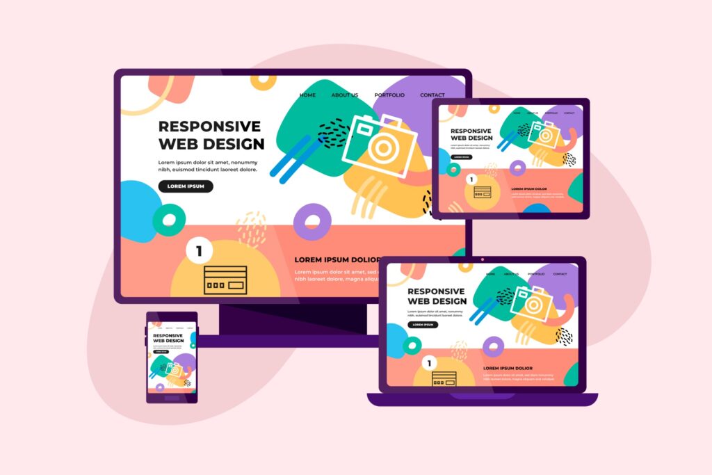
What is Responsive Design?
Responsive design means that your website adapts fluidly to different screen sizes and resolutions. Whether it’s a phone or a wide-screen desktop, the layout, images, and text adjust for the best readability and usability.
Step 1: Planning Mobile-First
My process always starts with a mobile-first approach. I first sketch and build the layout for mobile devices, then scale up for tablets and desktops.
Why mobile-first?
Over 50% of web traffic is from mobile devices
It helps prioritize essential content and UI
It ensures a clean, minimal, fast-loading layout
Step 2: Building with Elementor
I use Elementor Page Builder to build custom layouts. Elementor makes it super easy to:
Adjust layouts for desktop, tablet, and mobile separately
Hide/show sections depending on device
Change font sizes, padding, margins, and alignment per device
Pro tip: I always check each page in Elementor’s responsive mode to fine-tune the layout for all screen sizes.
Step 3: Using Responsive Units and Containers
Instead of using fixed pixels, I prefer relative units like %, em, rem, and vw/vh. I also use Elementor Flexbox Containers to create flexible layouts that automatically adjust.
Example in custom CSS:
.section-title { font-size: 2rem; }
Step 4: Testing Responsiveness
After designing the site, I use:
Elementor’s preview for desktop, tablet, and mobile
Chrome DevTools for live mobile testing
Free tools like Responsively App or Screenfly
This helps ensure buttons, text, spacing, and images look perfect across devices.
Whether I’m building a blog, business site, or eCommerce store, responsive design is part of every project I take on. WordPress + Elementor makes it easier than ever to design for every screen size without writing much code.
Need a responsive website for your business or personal brand? Let’s make it happen — [📩 Contact Me]